
FreshPrint's Group Order Live Re-design
Re-design Fresh Prints
Live Group Order
Year 2022
Platforms Desktop web, Mobile web
My Role Sole Designer, Research, User Testing, Interaction design, Visual design, Prototype
Fresh Prints is a custom apparel company based in NY. Their primary customers are college students, and they also have corporate clientele.
A live group order is a time-sensitive order link that is created when an organization has an event coming up and they want to allow their members to order custom apparel/products individually.
Problem
From Mixpanel data from early 2022, we can clearly see results are great after the third step, once the user adds items to cart and:
-
The customers are majorly dropping from Overview to PSP, and PSP to Cart page.
-
Mobile performance is lower than desktop.


Goals and metrics
To optimize conversions by approx. 20% increase on desktop and mobile version by improving the user experience of the group order design.

Research
After doing research which was done in three parts, 3 primary problems were identified.
Design Audit
Online Research
Usability Test Patterns

1. Dated
Visually it looks antiquated and out of touch with modern e-commerce experience in terms of design and interaction on both mobile and desktop.
2. Cluttered
There is visual scatter like lot of text, inconsistent and irrelevant info which is cognitively taxing to comprehend the important information and efficiently complete the task.
3. Untrustworthy
It doesn’t look familiar to e-commerce sites, and it misses vital information like zoom in design and product details, pricing status, best selling product, and how many people bought, contact info.
Opportunity
How might we make experience modern, relevant, and trustworthy?
We converted our key problems into opportunities to solve for during the redesign.
1. Dated > Modern
The user interface of the website should be visually refreshed, making it more fun and interactive by using modern standards of design.
2. Cluttered > Relevant
The redesign should make key features easier to find and use, remove underperforming features, and ensure we show the right content to the user.
3. Untrustworthy > Trust
The website must become a trusted place for people to buy from time sensitive website with familiar e-commerce experience.
Moodboard and Design System
Market study and modern design inspiration

GO is based on FP's design system, I have created for FP

Design Iterations
The new design went through many iterations before we had a final design candidate.
Designing product listing card layout for on overview page was a challenge as we wanted to bring e-commerce standard experience but don't want to lose freshprincy feel and keep it consistent with rest of the platforms.
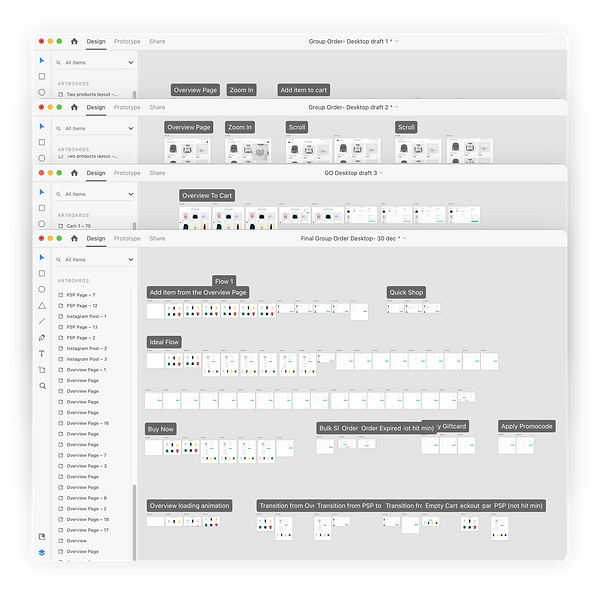
While working on iteration, we tested two options of wireframes with real users and moved forward with the option they prefered.
Desktop Prototypes
The following are final design prototypes that got launched.
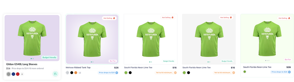
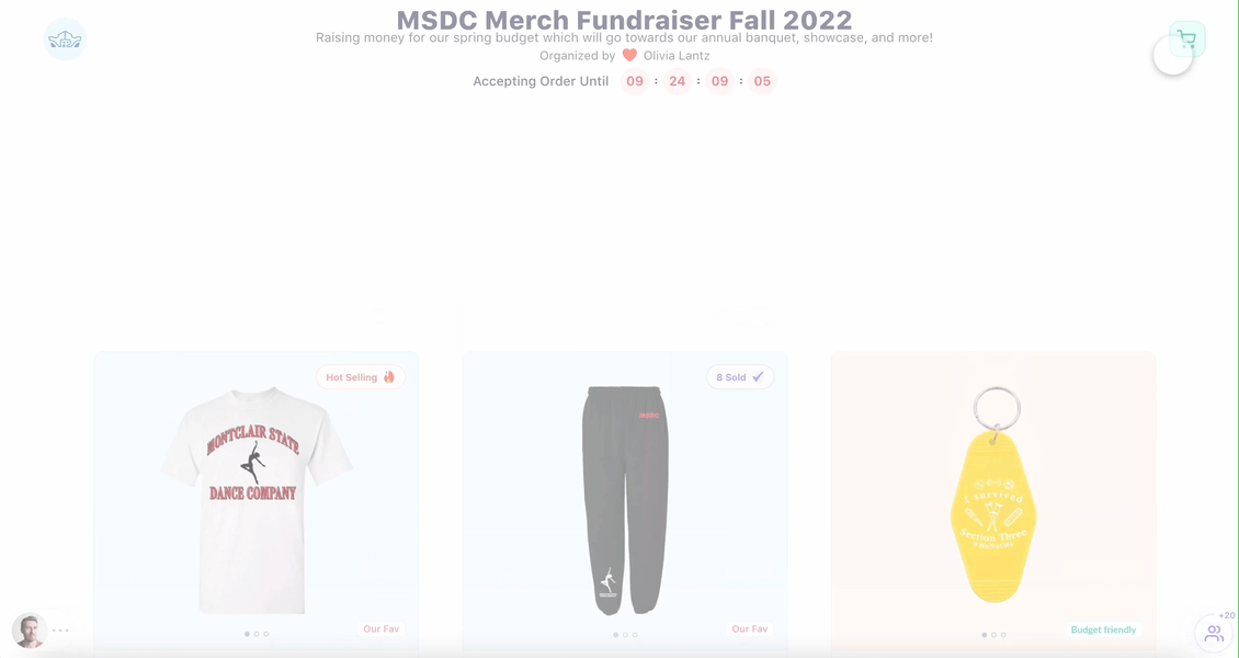
Overview to PSP Page
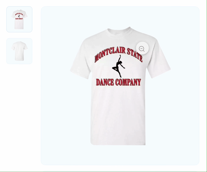
Zoom In and Out
Quick Add Products From Overview Page
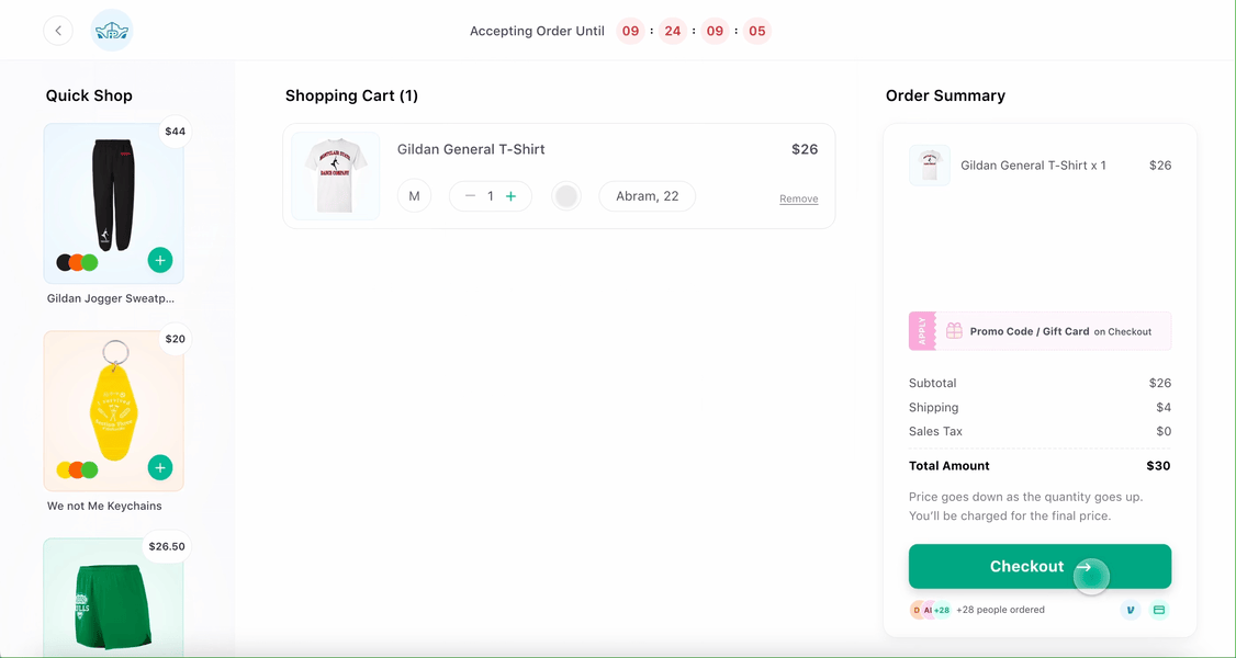
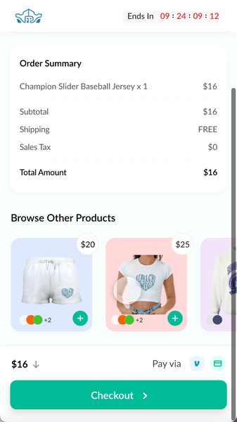
Cart to Checkout to Order Confirmation
Mobile Prototypes
Due to the low performance of mobile devices than desktop, we focused on mobile designs before desktop designs.
According to the research: 66% consumers in USA uses smartphone for online shopping in 2022.
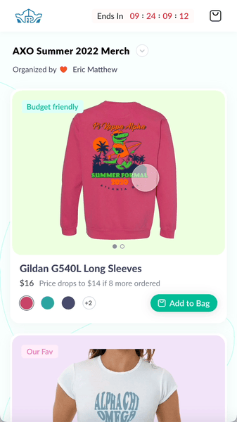
Adding item from Overview Page
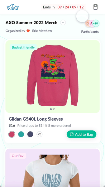
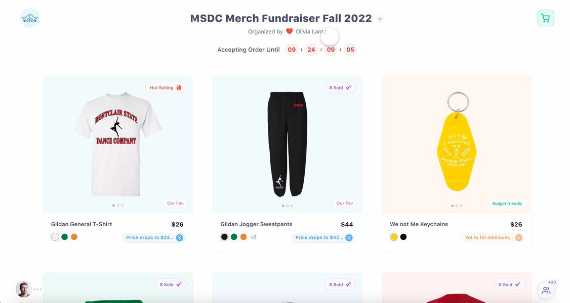
Overview Page

PSP Page

Cart to Checkout
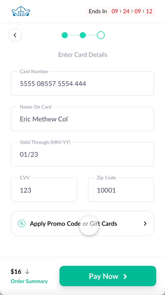
Apply Promocode or gift card
Apply Promocode or gift card
Usability Testing Mobile
1. Better conversion
According to the data from 2.5 months after launch, 20% more users were converted to mobile.
2. Modern and Relevant
People mentioned the mobile web is more modern, easy to navigate, and able to see designs and price info better than before.
3. Authentic
People liked recommendations of most sold and social proof on live link.
Next Steps
-
To do usability testing of the desktop version.
-
To upgrade changes on mobile incorporated on desktop version.